Midwest Capital
With the proliferation of SAAS companies and increased competition, financial planners have incentive to differentiate themselves in their markets. Midwest Capital had a visual identity that was feeling long-in-the-tooth and wanted to reintroduce themselves to the West Michigan market.
Disciplines: Art Direction, Graphic Design, Brand Development, Illustration

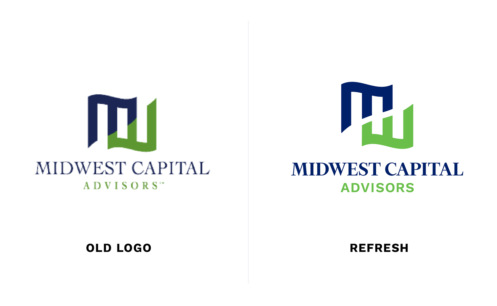
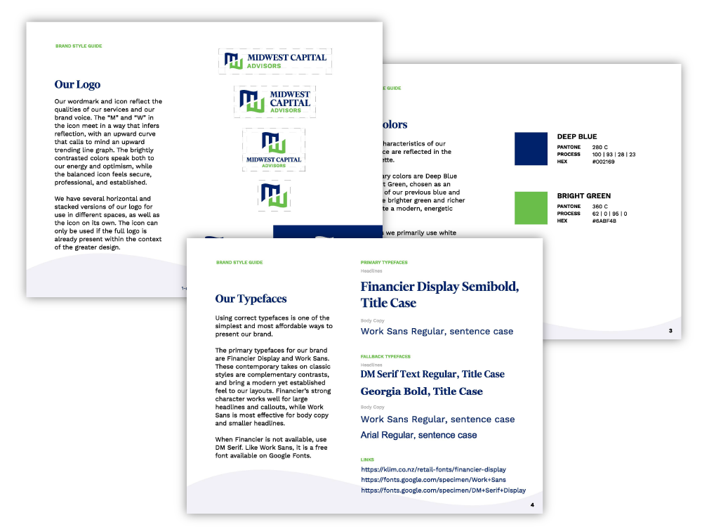
To create distance between themselves and their competition, Midwest Capital first needed a logo update that would improve legibility and brighten their image. I used the update to create some bold graphics and a typographic style that was more legible and friendly than the previous, while still maintaining a level of professional acumen.
Community arts class. Credit: Cultivate

Full color logo
One color logo with simplified mark
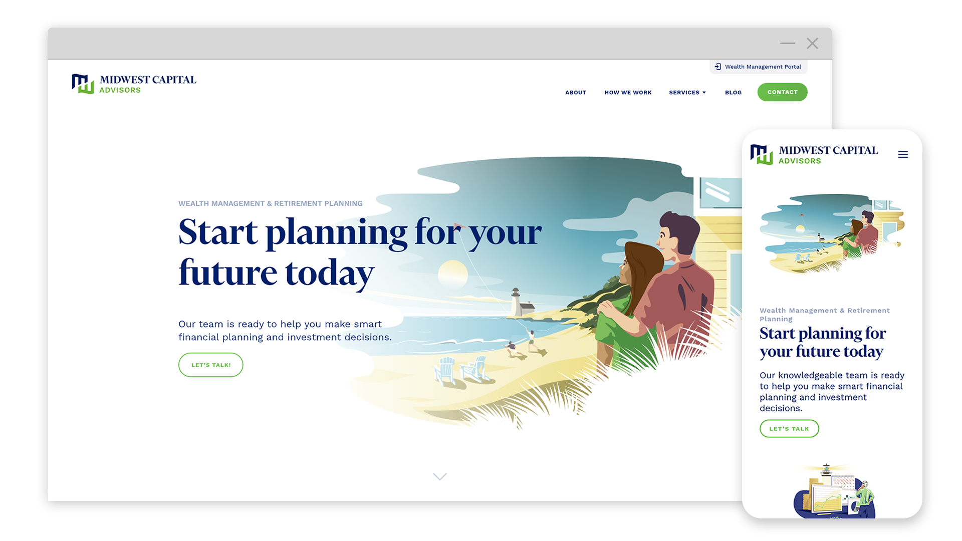
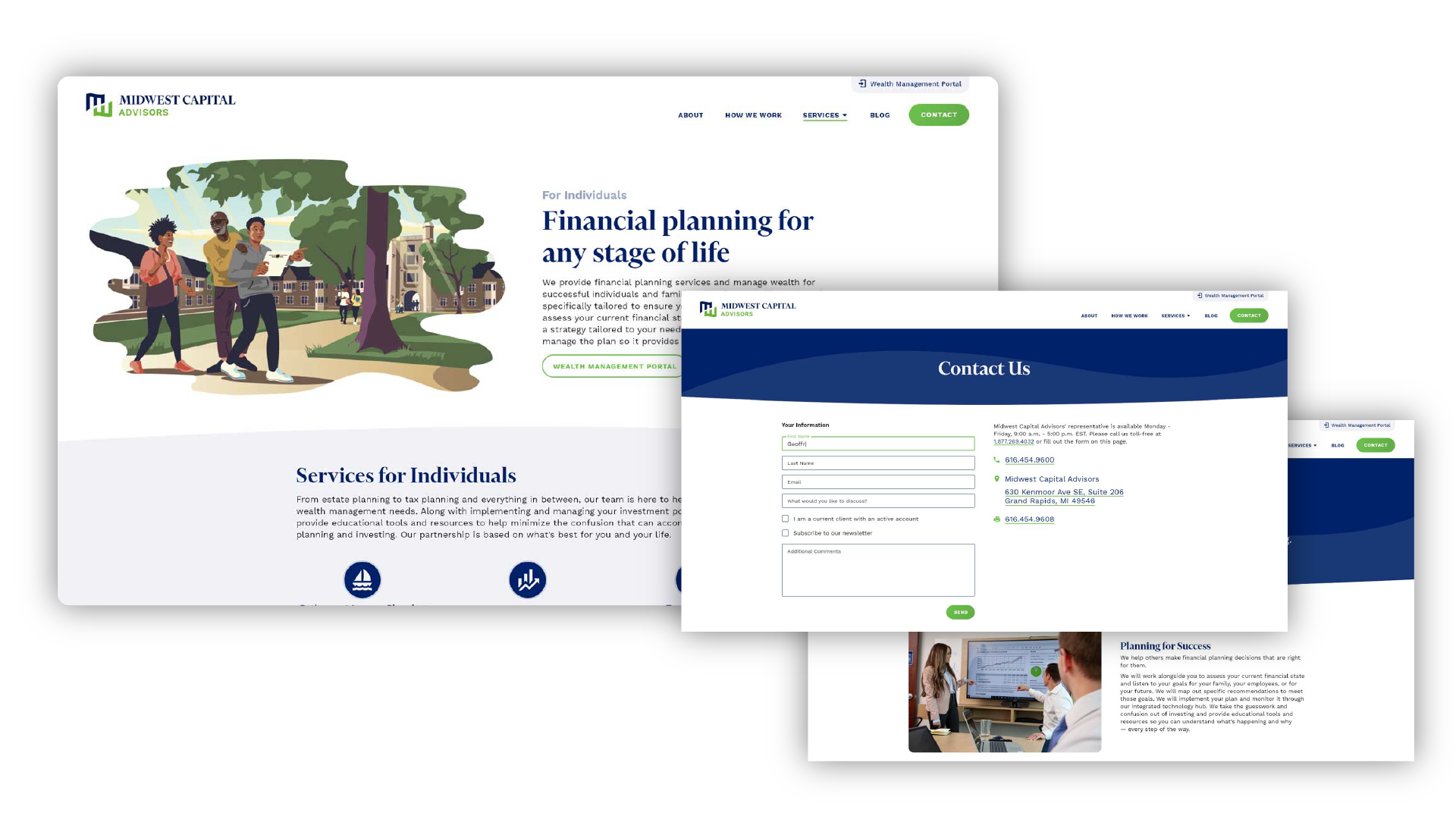
Along with the updated standards, I worked closely with the client to create a series of illustrations designed for use with different audiences and service lines. I created personas of each of their primary customers and placed them in environments that spoke to their aspirations and life situations. Whether it was highlighting the benefits of retirement or stressing the need to plan for life expenses, the illustrations maintained a sense of light and positivity.


On-site photography
On-site photography was taken to show the local team and balance the illustrations. Once assets were created, I helped plan and direct the design and development of their new website. A simplified navigation and plenty of whitespace helped focus users on content designed to break complicated service descriptions into easy to understand components and encourage action.