
Corporate Color
Printing is a craft I have found a lot of personal fulfillment in. When I was approached by Corporate Color, they had a desire to shed the... well, corporateness of their brand. I worked with them to create an identity that helped celebrate who they are and their chosen profession.
Disciplines: Graphic Design, Brand Development
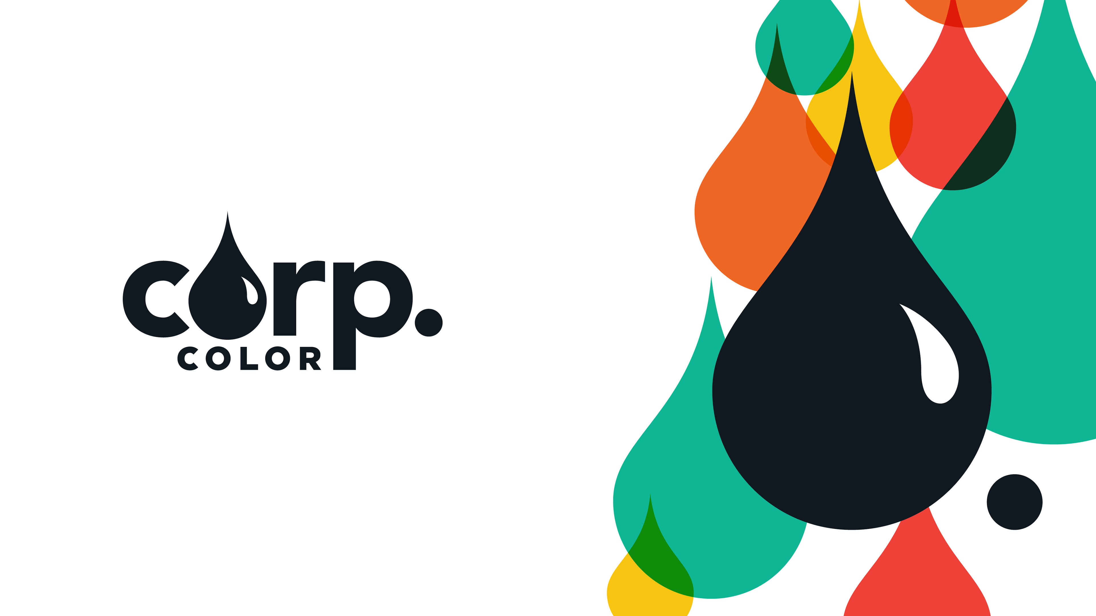
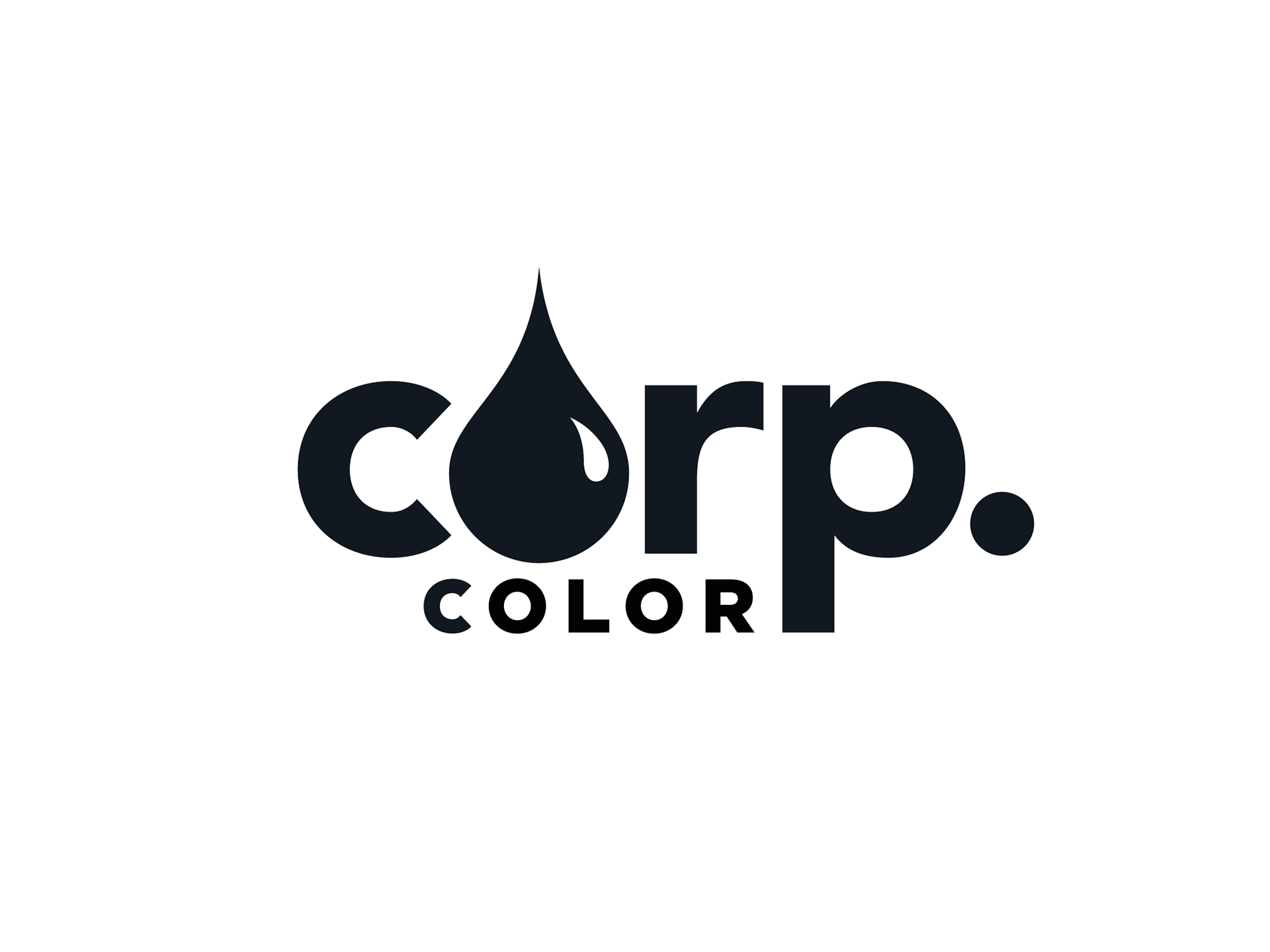
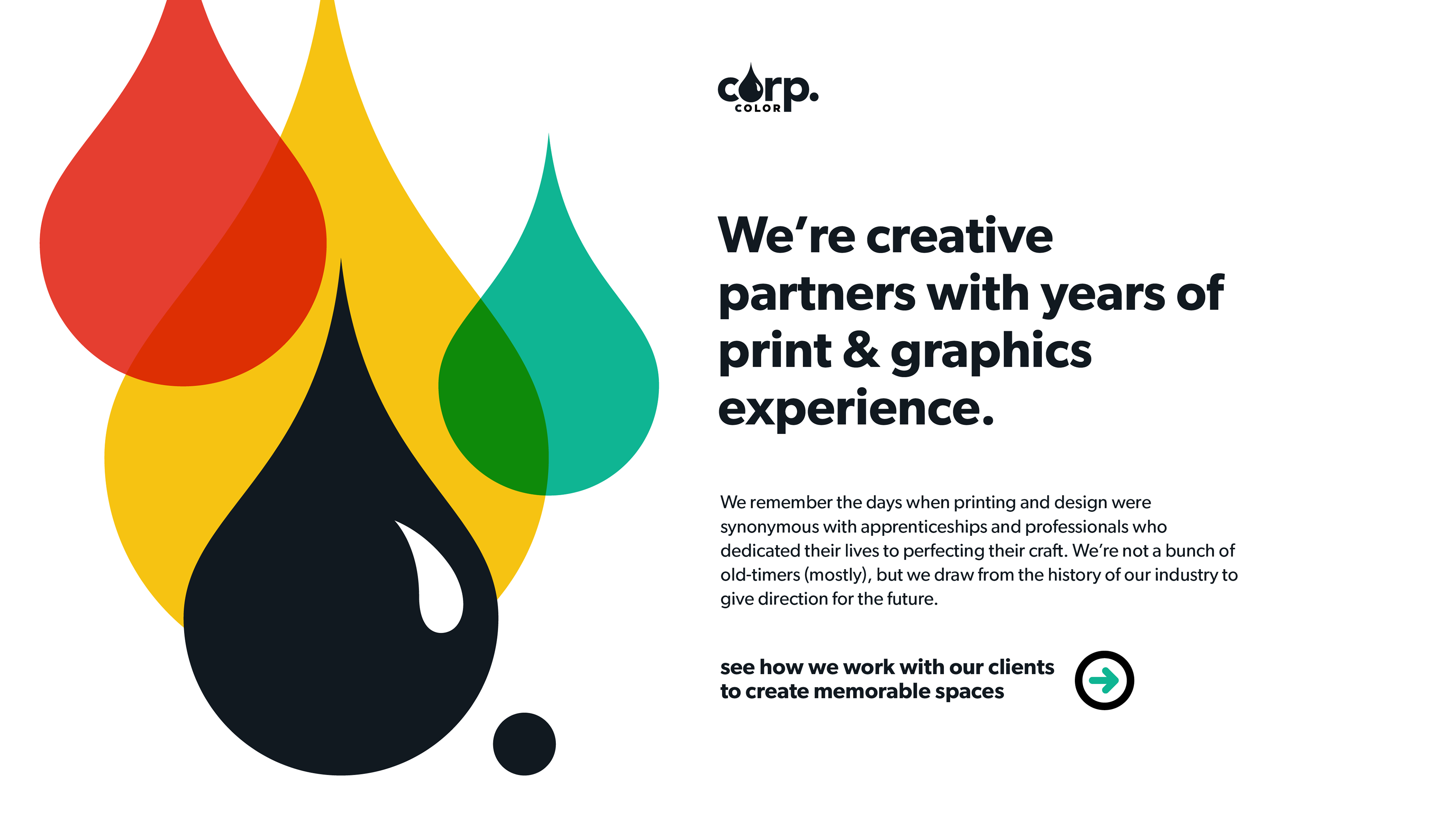
To set the tone for the rest of the brand voice, I wanted to establish up front a bold, down-to-business approach with the logo. I avoided the CMYK cliche and went all black, abbreviating "Corporate" and introducing the Drop. The simplicity of the mark elevates the story, representing the presence of all colors with a rich black and adopting the persona of a seasoned craftsman with the purposefully clipped presentation. The Drop on its own works as a further abbreviation of the abbreviation and anchor layouts.
Logo
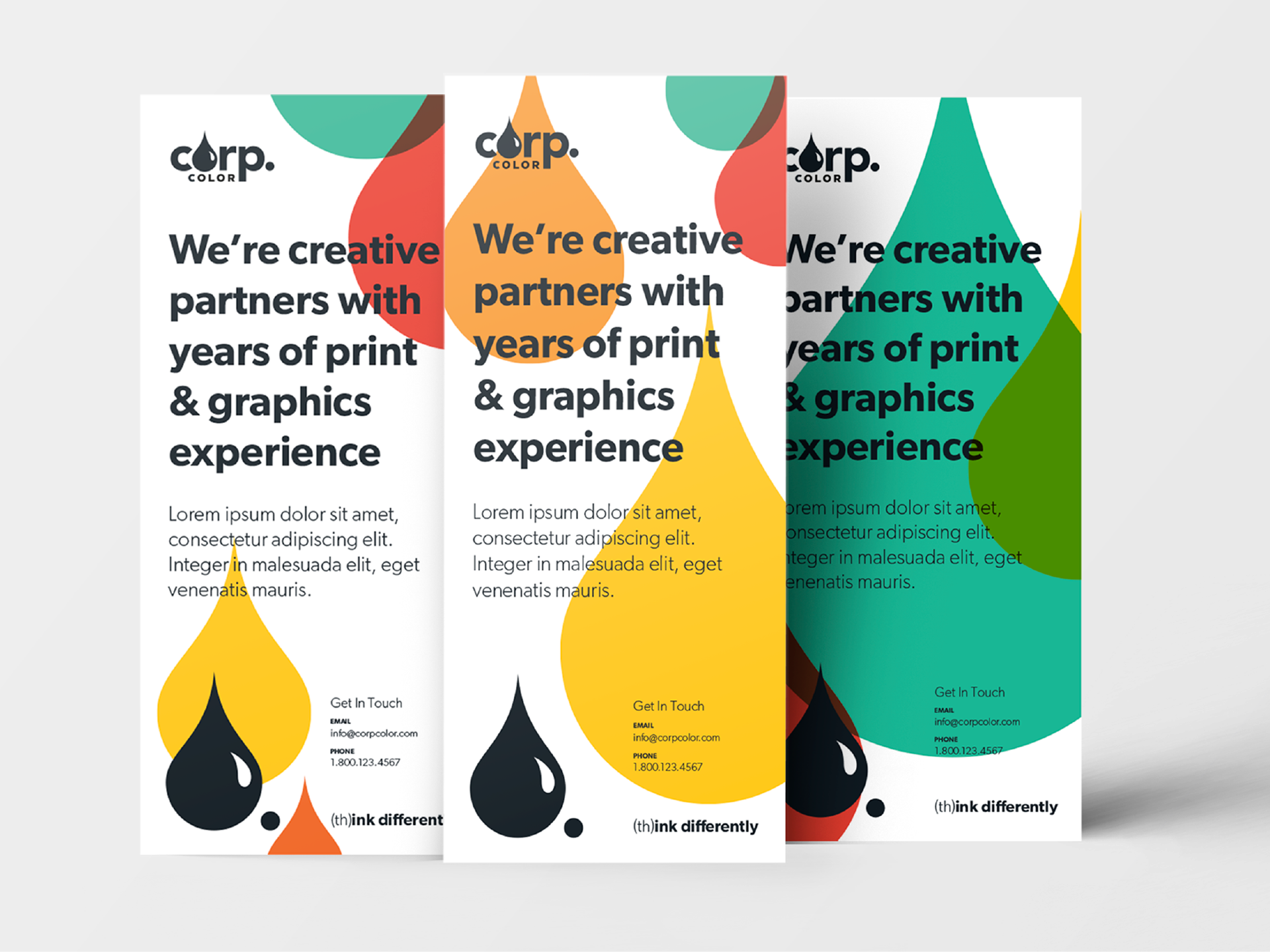
Rack cards
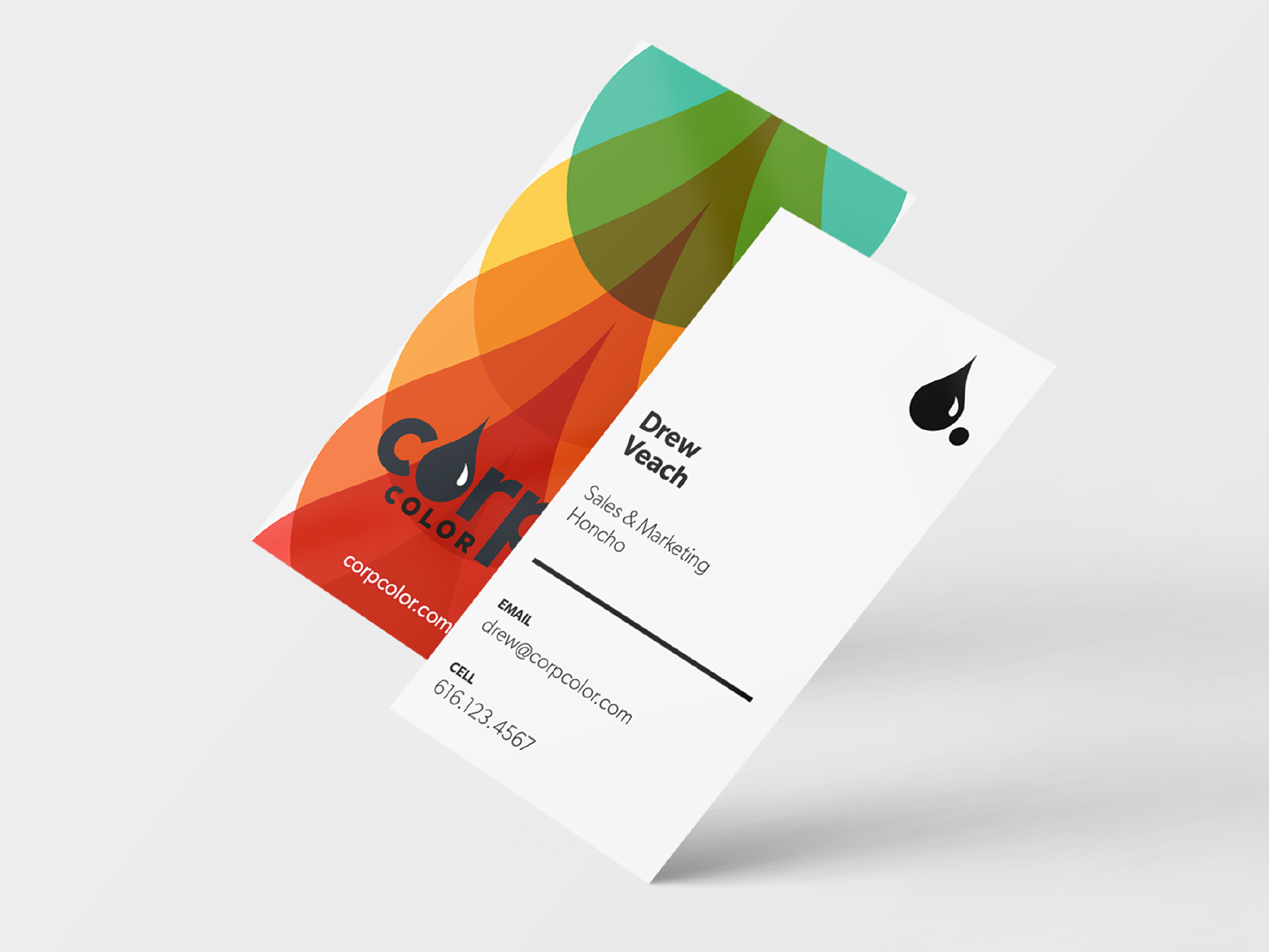
Business cards

Extending the identity by using the Drop, I created a system of colored overlays, representing overprinting techniques from letterpress and block printing with a bright spectrum of colors, chosen to align with Pantone color standards for ease of replication. I then created a handful of taglines and positioning statements to flesh out layouts and build out the brand guide.
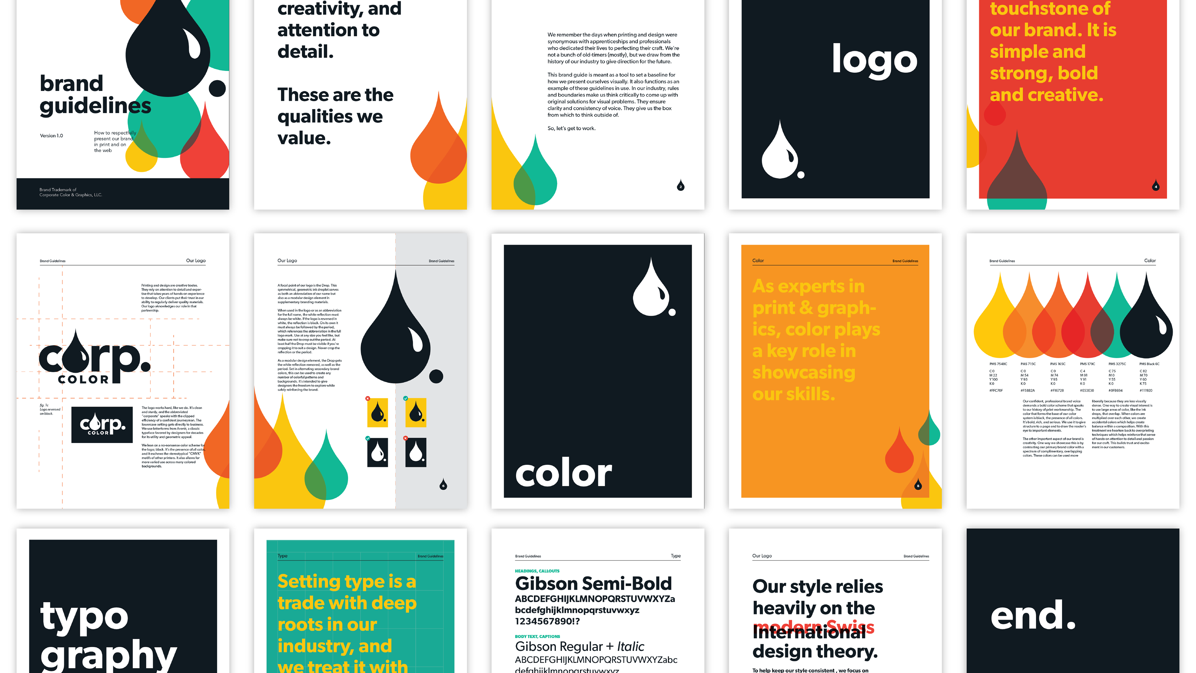
Brand guide